Tip #2 Apply the rule of thirds
This one has been around for awhile and it capitalizes on the fact that our eyes are naturally drawn to a point about two-thirds of the way up or over on a photo. When you are taking a picture, mentally divide your screen into 3rds and you will want to compose your photo to that your subject is located at one of the intersecting points. So much for trying to get everyone centered! Turns out it looks better if they are off center a bit. Of course there are situations where this would not be best, but after looking through my photos, I find it to be mostly true.
Here is an image with the grid to help visualize:
 Tip # 3 Keep and eye on the horizon
I don't have any photo examples for this one, but basically you are supposed to place the horizon about 2/3 up on a photo to keep the focus on what is below (land or water) or position it 1/3 the way up to keep the focus on the sky.
Tip #4 Frame your subject
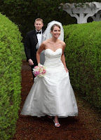
You can use architectural elements or things in nature to frame your subject for visual interest.
Our wedding photographer used the 2 hedges to frame us in the photo below

Tip #5 Fill the frame

Tip#6 Try a new perspective
This encourages you to take horizonatal and vertical shots of the same subject, or to hit the ground when taking pictures of kids and pets to see the world through thier view.
This was a fun week, and I know you can't use all of these at the same time, but I look forward to experimenting with them!

No comments:
Post a Comment