Sunday, August 29, 2010

12 weeks to better photography: capturing action

This week's lesson was about shooting things on the go, like kids, sports, and pets.  One of the best ways to do this with an SLR is to adjust the shutter speed so you can freeze the action. This technique is used alot in sports, like NASCAR racing, cycling, etc.  The lesson this week was pretty easy for me: take a portrait of your pet in-motion.  Every Saturday morning that we are in town, we try to take Morgan over to the dog park and I will always bring my camera along to take some pictures of her.  Here are some that I took of her "in-motion" with a fast shutter speed. 


Next week is all about portraits and I am excited about that one, I think I have a lot to learn about portrait shots!

Sunday, August 22, 2010

12 weeks to better photography: shooting outdoors

Week 7's lesson was on shooting outdoors. It talked about how you are not supposed to position your subject in direct sun because it leads to shadows and over-exposure.  The main problem though is that thier eyes are most likely squnting if they are looking into the sun.  I always thought that you were supposed to have the sun behind the subject, but the article says it's best to have the sun on the side.  If it is directly behind the subject, then the lens is facing the sun which can cause lens flares.  So, the assignment this week was using macro mode in outdoor photograpy.  This is great for me, because I just got a telephoto lens for my birthday and have not had much practice yet.  Ideally, I would have been able to find a butterfly, bird, caterpiller or some kind of small creature to photograph, however I did not see anything so I decided to use the street sign.  I sat on the front porch and then took the first photgraph at 70 mm.


For the second one, I zoomed all the way to 300 mm and was still sitting in the same spot. This lens sure would have been nice to have on our trip in the spring!


Sunday, August 15, 2010

12 weeks to better photography: shooting indoors

Halfway through the 12 weeks!  This week was about shooting indoors, making compromises, and using natural light to get better results.  I had a hard time this week because it was very cloudy and rainy this weekend, so I did not have much natural light to work with.  So, I think I understood this, but would like to try it again sometime.  We were supposed to position our subject parallel to the window while we stood perpendicular to the window to take advantage of the natural light.

So this is pretty good I guess without the flash but I think next time I would have him move away from the window so the glare is not there and see if that still worked.  I pulled John away from a very important computer game, so he was not very happy to be my subject, but Morgan could not stay still so he agreed.


This is when I had John face the window while I stood in front of the window to try and capture catchlights (highlights from the window).  You can see them below in John's eyes.  I thought this was a neat trick.


Sunday, August 8, 2010

12 weeks to better photography: composition

For week 5, the lesson stepped away from the techical parts of the camera and was all about composition. Composition is an art and there are no hard rules; what may appeal to some people may not appeal to others; but there are some tips that are generally accepted to be true.
Tip #1- Keep it simple

This is about eliminating distractions in the background and foreground to make sure that your subject is the first place the eye goes when looking at the picture. I took this picture of John below in March, 2008 in Germany. I probably should have had him step away from the pillars because when you look at this picture at a glance, you notice the red stocking caps- not John below.


Tip #2 Apply the rule of thirds

This one has been around for awhile and it capitalizes on the fact that our eyes are naturally drawn to a point about two-thirds of the way up or over on a photo. When you are taking a picture, mentally divide your screen into 3rds and you will want to compose your photo to that your subject is located at one of the intersecting points. So much for trying to get everyone centered! Turns out it looks better if they are off center a bit. Of course there are situations where this would not be best, but after looking through my photos, I find it to be mostly true.

Here is an image with the grid to help visualize:


Tip # 3 Keep and eye on the horizon

I don't have any photo examples for this one, but basically you are supposed to place the horizon about 2/3 up on a photo to keep the focus on what is below (land or water) or position it 1/3 the way up to keep the focus on the sky.

Tip #4 Frame your subject

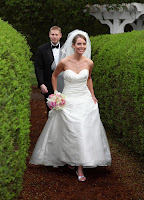
You can use architectural elements or things in nature to frame your subject for visual interest.

Our wedding photographer used the 2 hedges to frame us in the photo below

Tip #5 Fill the frame

In order to give the subject more prominence and focus, one technique is to fill the frame so there really is no where else for the eye to go. You can achieve this with any existing photo by cropping out the subjects face, or you can get real close in the first place. Below is a picture of Abbie, I think Samantha took this one, but it's a good example of filling the frame.


Tip#6 Try a new perspective

This encourages you to take horizonatal and vertical shots of the same subject, or to hit the ground when taking pictures of kids and pets to see the world through thier view.

This was a fun week, and I know you can't use all of these at the same time, but I look forward to experimenting with them!


Sunday, August 1, 2010

12 weeks to better photography: experimenting with fill flash

I have been dreading doing this challenge because I hate flash, but I didn't want to skip over it completely, so here we go. This week's lesson was about using fill flash, which still uses the flash, but instead the fill flash will just fill in areas that it thinks are poorly lit instead of lighting the entire subject. In order to test this out, I dragged John away from the new NCAA 2011 football game and asked him to be my subject- thankfully it was pretty cloudy outside so you can see some difference.


No flash


Full flash- yuck!


Fill flash- you can see that the colors in John's CSU shirt are brighter than in the first one, but there is no artificial glare like the second one.


So, I may have to give fill flash a try next time I want to try and get colors to pop outside!